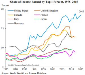
The line chart shows the total percentage of income earned by the top 1% of the population in 7 different countries from 1975 to 2015.
The line chart shows the total percentage of income earned by the top 1% of the population in 7 different countries from 1975 to 2015.


Leave feedback about this